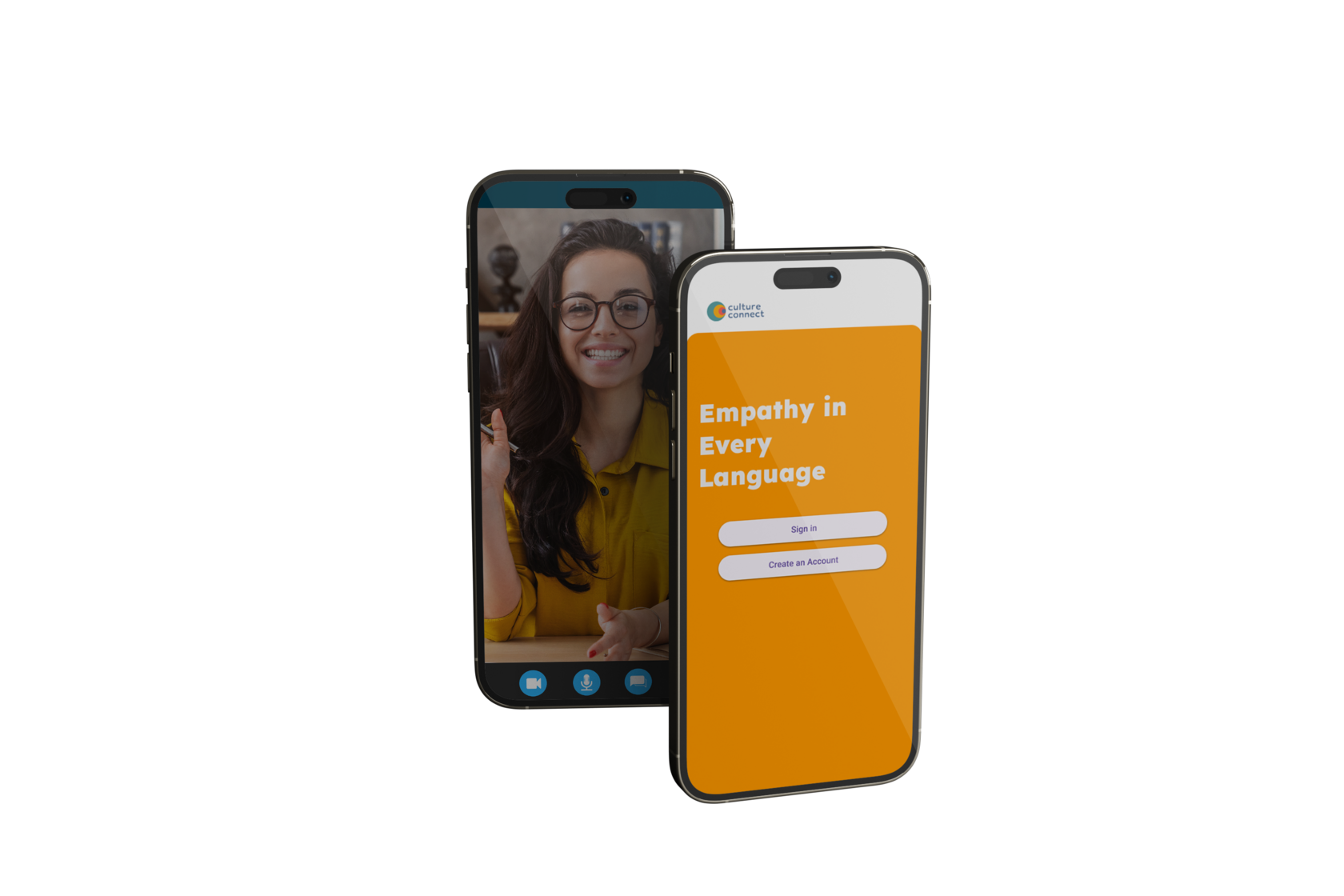
Project Overview
Culture Connect links users to therapists who share their cultural background and speak their native language, ensuring culturally competent mental health care by eliminating language barriers and fostering cultural understanding, the app enhances communication, trust, and therapeutic outcomes for individuals from diverse backgrounds
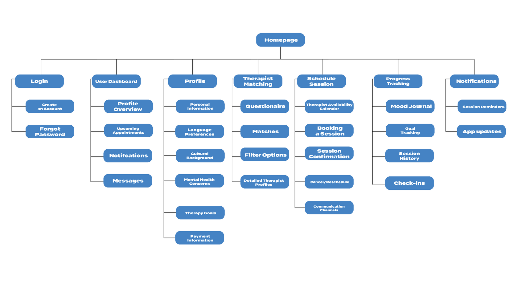
Sitemap
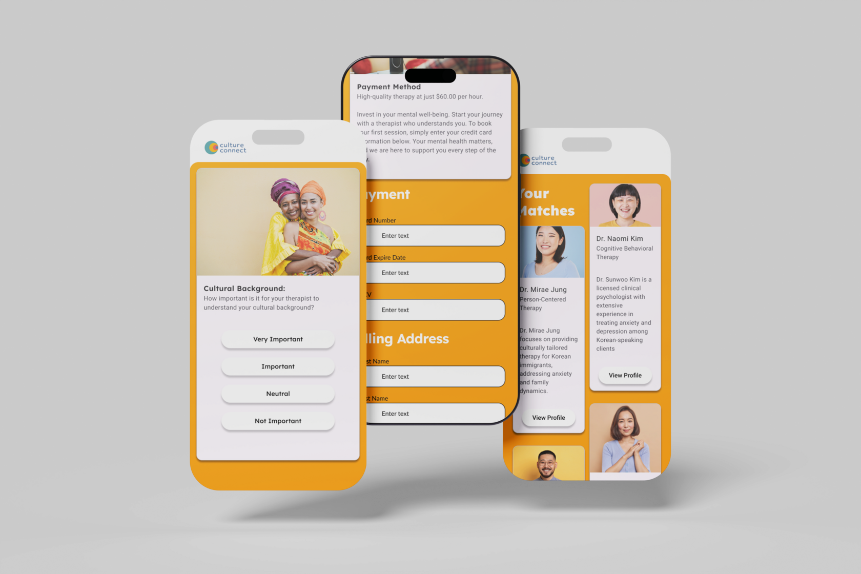
After Usability Study

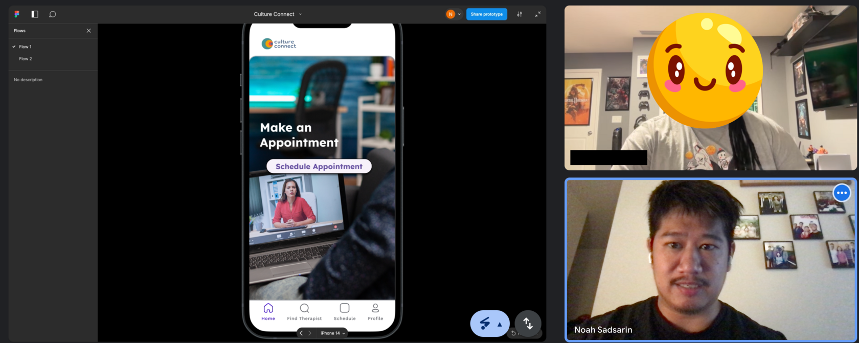
The Problem
Individuals from diverse cultural backgrounds struggle to find effective mental health care due to language barriers and lack of culturally competent therapists
The Goal
Primary Goal: Develop an app that specifically connects users with therapists who share their cultural background and speak their native language. This app will facilitate culturally competent mental health care by ensuring effect communication, cultural background, and trust between the therapist and client
My Role
Lead UX Designer, UX Researcher, Visual Designer,
Graphic Designer
Graphic Designer
Responsibilities
Conducting Interviews, Paper and Digital wireframing, low and high-fidelity prototyping, conducting usability studies, iterating on designs and responsive web design
Research Summary
I conducted users interviews, which I then turned into empathy maps to better understand the target users and their needs. I discovered that many target users treat online therapy as a way to articulate their thoughts. However, many therapy apps lack features thta help ensure that these thoughts are understood which frustrates the user. This caused a normally enjoyable experience to become challenging and problematic.
Jessica's User Journey Map
I created a user journey map of Jessica's experience using a competitor's counseling site to help identify possible pain points
Low-Fidelity Prototype
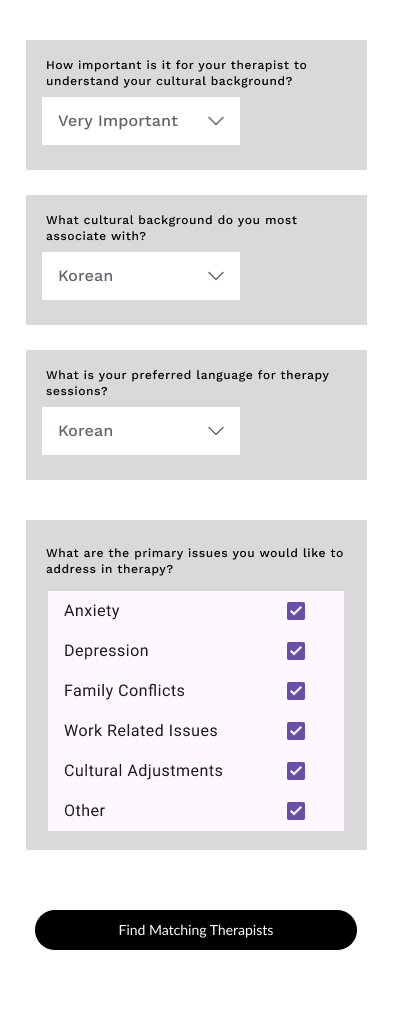
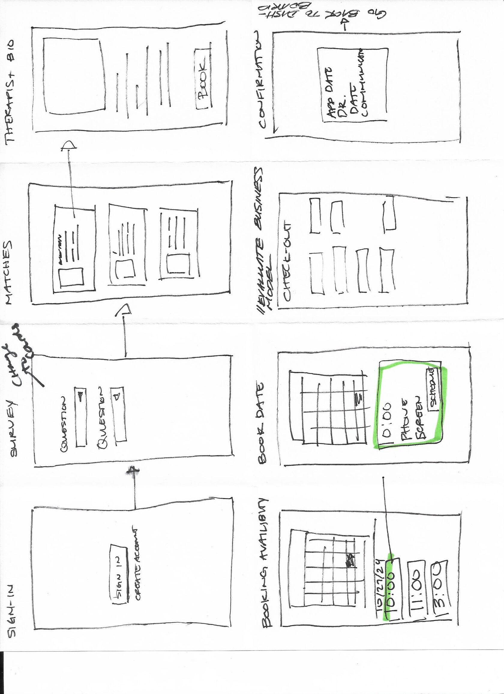
The first user flow emphasizes a user's sign up process. The user will take a questionnaire, and be matched to corresponding therapists.
Usability Parameters
Study Type: Unmoderated and moderated usability study.
Location: Remote
Participants: 5 Participants
Length: 20-30 Minutes
Location: Remote
Participants: 5 Participants
Length: 20-30 Minutes
Pattern Observation
Observation 1: 4 out of 5 users were uncomfortable when viewing a monetary value next to a headshot of a therapist.
Observation 2: 3 out of 5 users felt the form of the questionnaire was intimidating.
Observation 3: All 5 users need a way to save their checkout information.
Observation 4: All 5 users will most likely attend therapy once or twice a month.
Observation 2: 3 out of 5 users felt the form of the questionnaire was intimidating.
Observation 3: All 5 users need a way to save their checkout information.
Observation 4: All 5 users will most likely attend therapy once or twice a month.
Mockups and Insights
Based on the theme that paying for four appointments and attending these appointments is difficult for all users, an insight is: Users need a way to pay for appointments individually.
Based on the theme of paying for therapy appointments, an insight is: Users need a way to save their payment information in order to avoid the monotonous scheduling process.
Based on the theme of taking the questionnaire, an insight is: Users need a way to be prompted with a one question at at time.
Before Usability Study
Accessibility Considerations
Headings: I used headings with different sized text in order to establish visual hierarchy
High Contrast: I used a high contrast color palette in order for users to better distinguish visual elements. In addition, I created hover and on press animations in order to allow the user to identify where they are within the app and what they have selected.
High Contrast: I used a high contrast color palette in order for users to better distinguish visual elements. In addition, I created hover and on press animations in order to allow the user to identify where they are within the app and what they have selected.
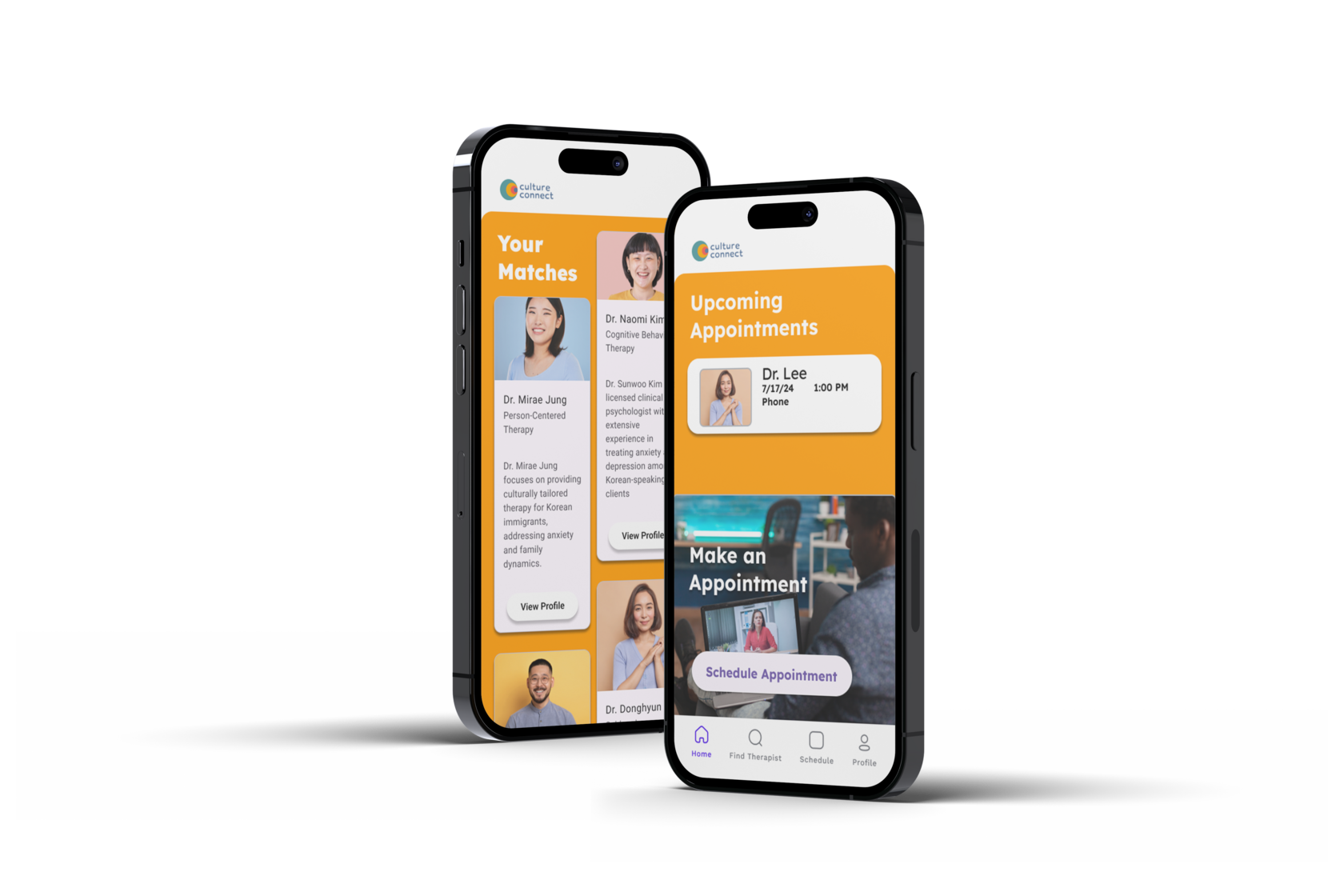
High-fidelity Prototype
I included new screens to the high-fidelity prototype that I discovered in my initial usability tests.
Takeaways
Impact: Our target users have asserted that the design was very minimal and allowed them to easily make decisions with little to no distractions.
What I learned: I learned that Hick's Law allows the user to complete tasks faster. On the other hand, minimalistic approaches to design may mitigate the features that would enhance the users experience. I learned to discern the priorities of "nice-to-have" features and a minimum viable product.
What I learned: I learned that Hick's Law allows the user to complete tasks faster. On the other hand, minimalistic approaches to design may mitigate the features that would enhance the users experience. I learned to discern the priorities of "nice-to-have" features and a minimum viable product.
Next Steps
Look into insurance processes in order to integrate deductibles and co-pays.
Paper Wireframes
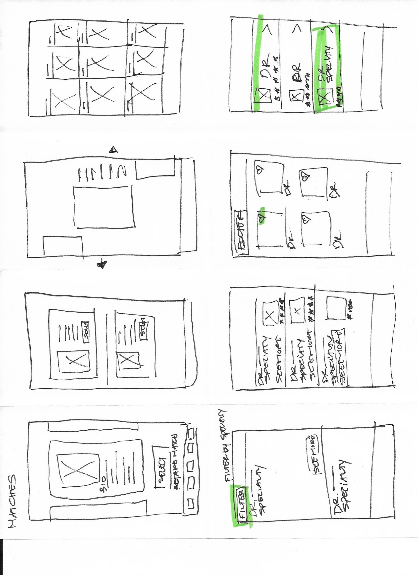
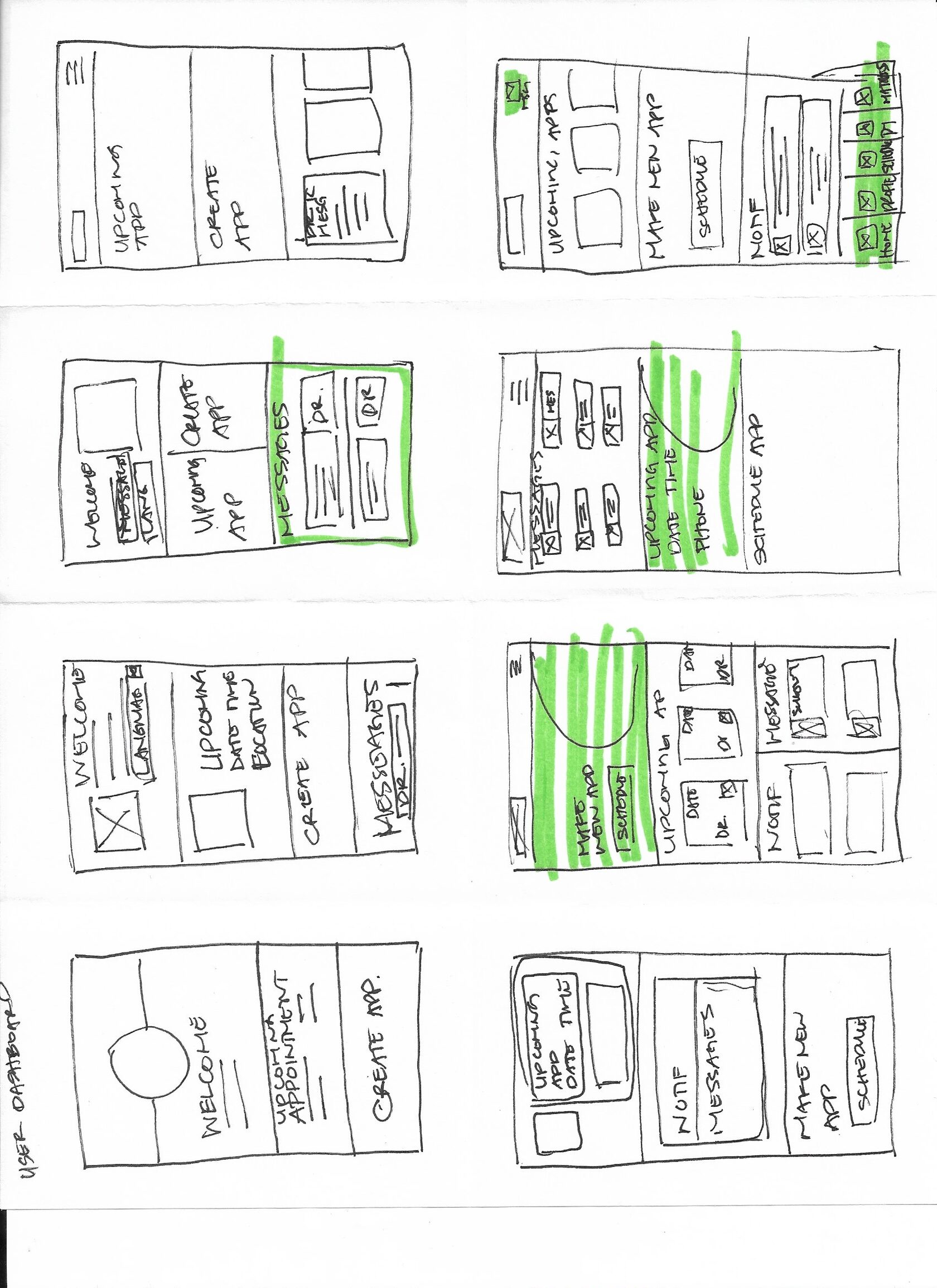
I sketched out paper wireframes for each screen in my app, keeping the user pain points in mind about navigation, browsing, selling, and checkout.
This user dashboard paper wireframe variations to the right focus on Hick’s law and enabling the user to make an easier decision.
This user dashboard paper wireframe variations to the right focus on Hick’s law and enabling the user to make an easier decision.
Jessica Kim
Jessica is a 32-year-old Korean immigrant living in the USA, working as a graphic designer. She has been experiencing anxiety, particularly related to work and family conflicts, and finds it difficult to express her emotions in English.
Jessica's Problem
Jessica struggles to find a therapist who speaks Korean and understands her cultural background, leading to feelings of being misunderstood and frustrated during therapy sessions.
Frustrations
- Language Barrier: Difficulty articulating her thoughts and emotions in English.
- Cultural Disconnect: Therapists do not understand her cultural context and values.
- Mismatched Therapists: Often gets paired with therapists who lack cultural competence.
Goals
- Find a therapist who speaks Korean fluently.
- Receive culturally sensitive therapy that respects and understands her cultural background.
- Improve her mental health and manage her anxiety effectively.

User Research Pain Points
Language Barriers: Users struggle to communicate their mental health concerns effectively in a non-native language, leading to miscommunication and less effective therapy.
Inflexible Payment Options: We understand that not everyone needs to see a therapist every week. Some users prefer to have therapy sessions bi-weekly or even just once a month
Inflexible Payment Options: We understand that not everyone needs to see a therapist every week. Some users prefer to have therapy sessions bi-weekly or even just once a month
Cultural Disconnect: Therapists without cultural competence may misinterpret culturally specific behaviors, values, and expressions, resulting in misunderstandings and reduced efficacy of the therapy.
Surprise Payments: Users are not notified that their are being charged and are confused as to what they were charged for.
Surprise Payments: Users are not notified that their are being charged and are confused as to what they were charged for.
create your own happiness
