

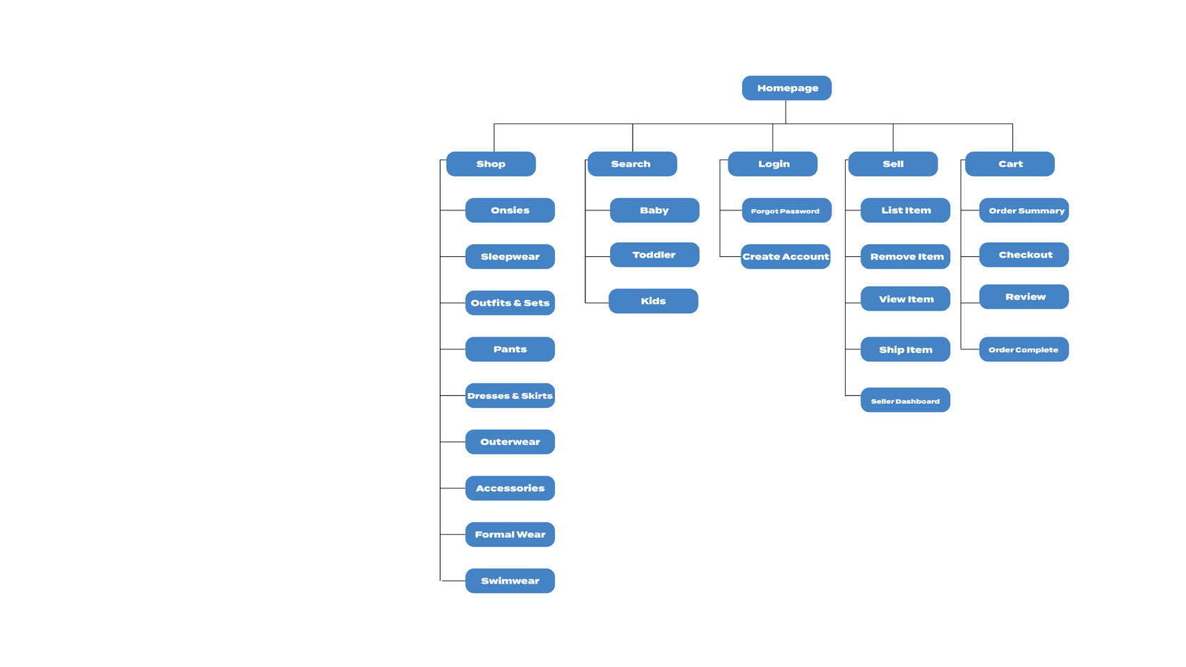
Sitemap
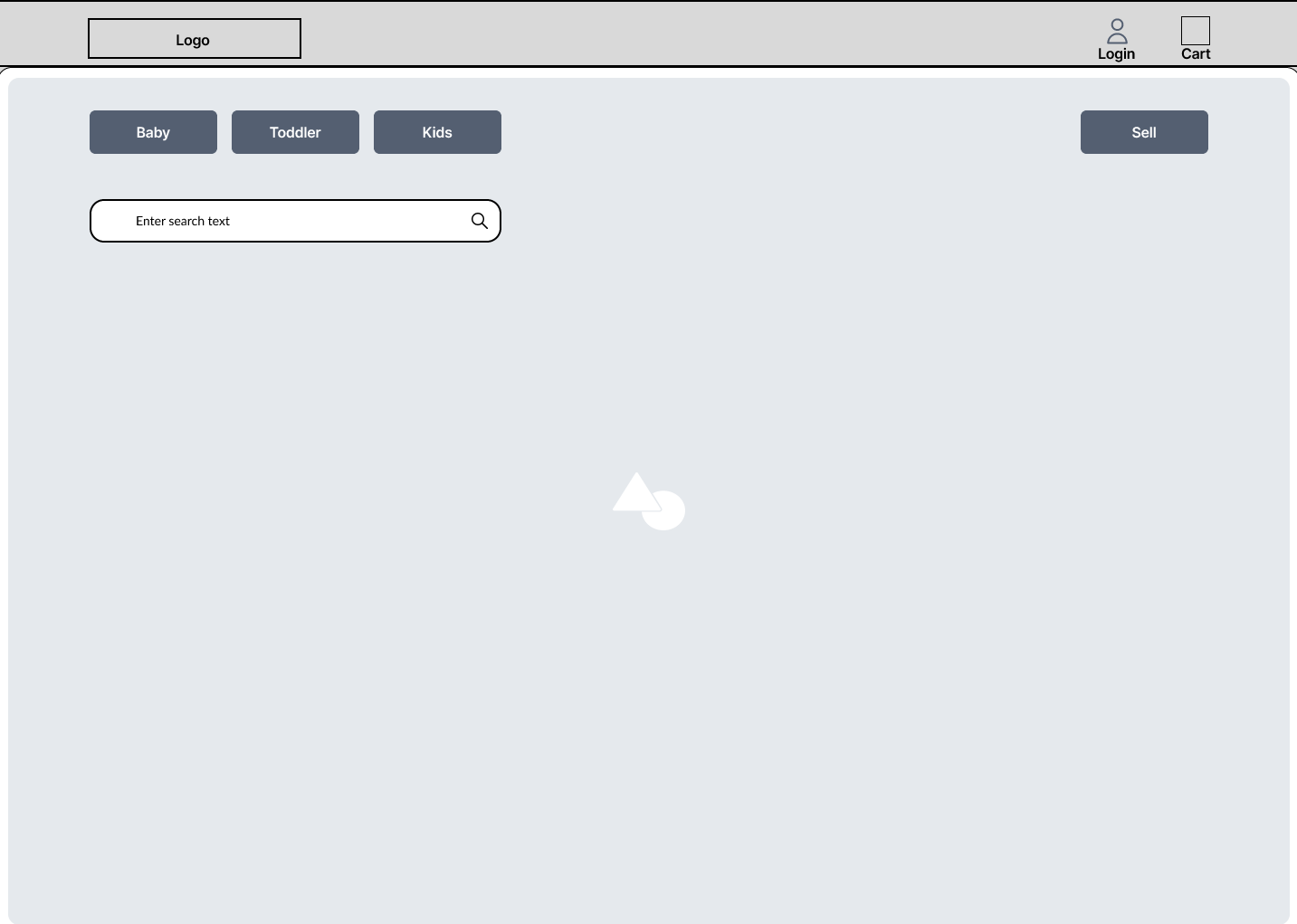
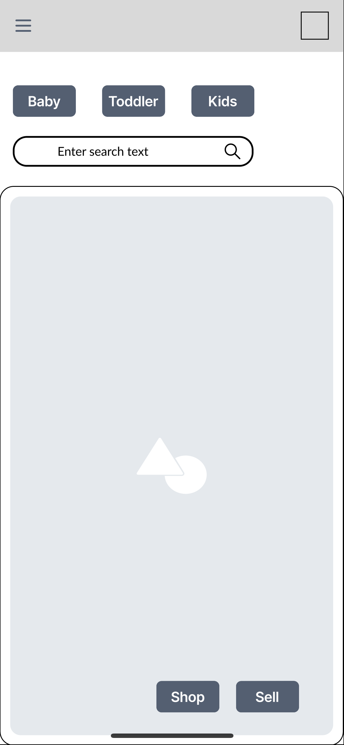
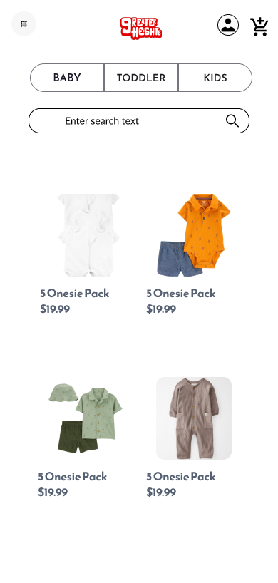
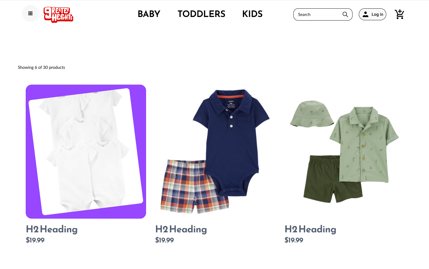
Digital Wireframe Screen Size Variation
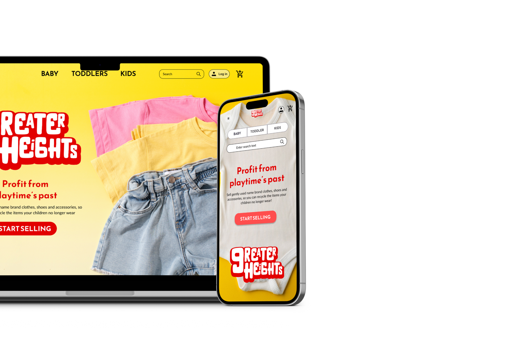
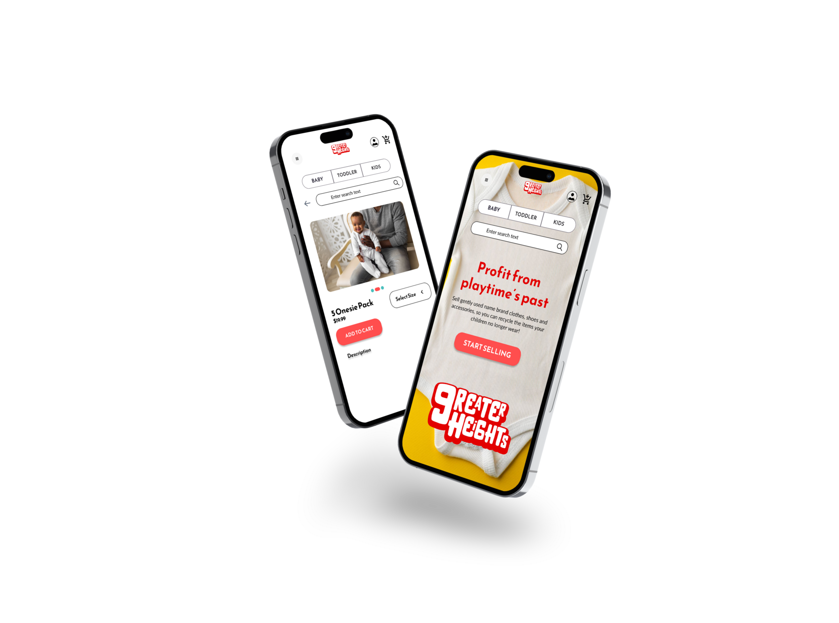
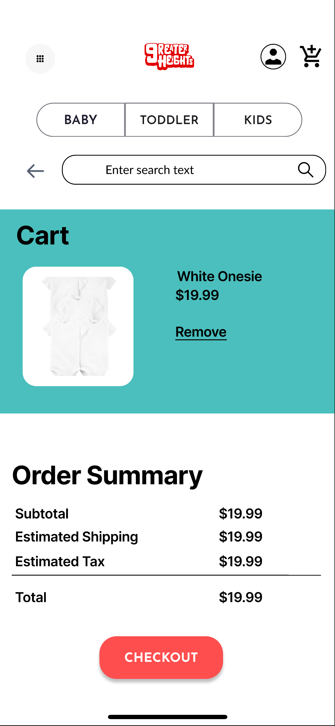
Mockups: Original Screen Size

Project Overview
A comprehensive marketplace for buying and selling children’s clothing, offering a wide selection of new and pre-owned apparel for kids of all ages.
The Problem
Parents and caregivers often struggle to find affordable, quality children’s clothing that accommodates rapid growth and changing needs; a comprehensive marketplace for both new and pre-owned kids’ apparel can provide diverse, budget-friendly options while promoting sustainable shopping practices.
The Goal
Primary Goal: Develop a user-friendly online platform that offers a diverse selection of affordable and high-quality children’s clothing, ensuring parents and caregivers can easily find suitable options for their kids’ growing needs.
Secondary Goal: Provide a selling platform for children’s clothes.
Secondary Goal: Provide a selling platform for children’s clothes.
My Role
Lead UX Designer, UX Researcher, Visual Designer, Graphic Designer
Responsibilities
UX researcher, wireframing, prototyping, testing, documentation, brand identity
Research Summary
To inform the development of our user-friendly online platform for children’s clothing, I conducted in-depth interviews and user surveys. My goal was to deeply understand the frustrations, needs, and preferences of parents and caregivers in sourcing affordable and high-quality clothing that adapts to their children’s growing needs. By choosing qualitative research methods, I engaged in meaningful conversations with our target users, gaining valuable insights into their shopping experiences and preferences. These insights are pivotal in shaping our platform to cater effectively to their demands, ensuring a seamless and satisfying shopping experience where every child’s clothing needs are met with ease and affordability.
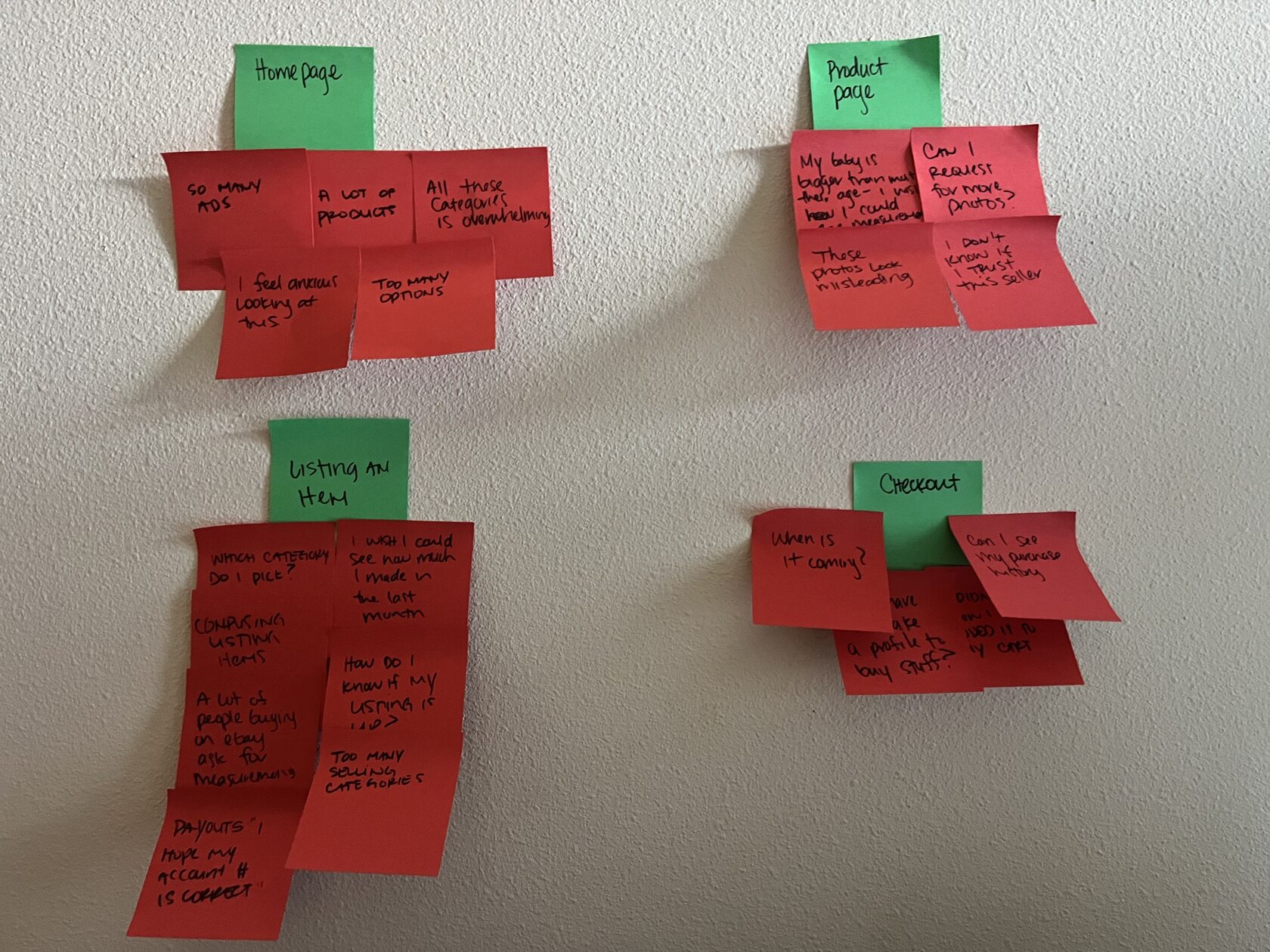
User Research Pain Points
Overwhelming Content: User may find it hard to digest content as there are too many visual elements on the landing page as well as menu.
Categories: Users may find it hard to navigate through categories that are nested within lists.
Lack of Customer Reviews: Users may find it challenging to make informed decisions without access to detailed customer reviews and ratings especially for new or lesser-known brands.
Ambiguous arrival times: Users may feel anxious as they are not notified when their item is arriving.
User Journey Maps
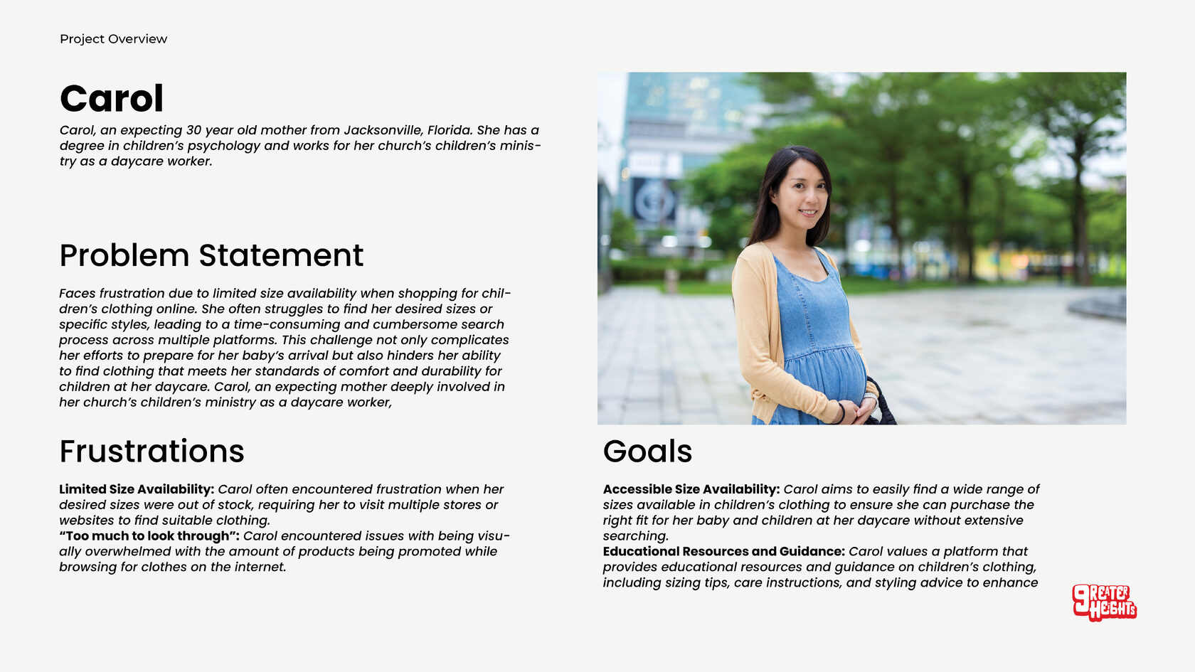
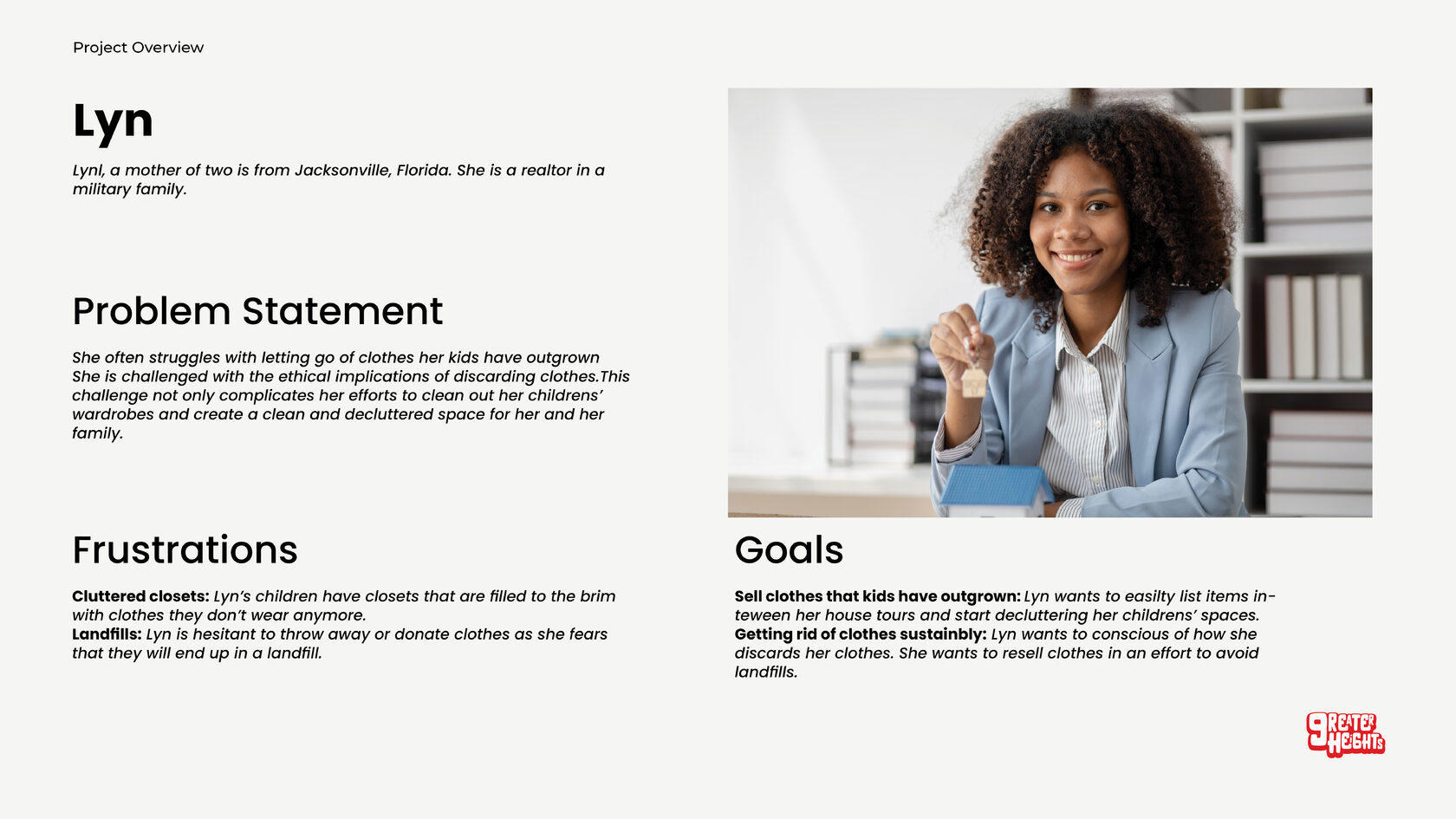
I created a user journey map of Carol and Lyn's experience using a clothing site to help identify possible pain points
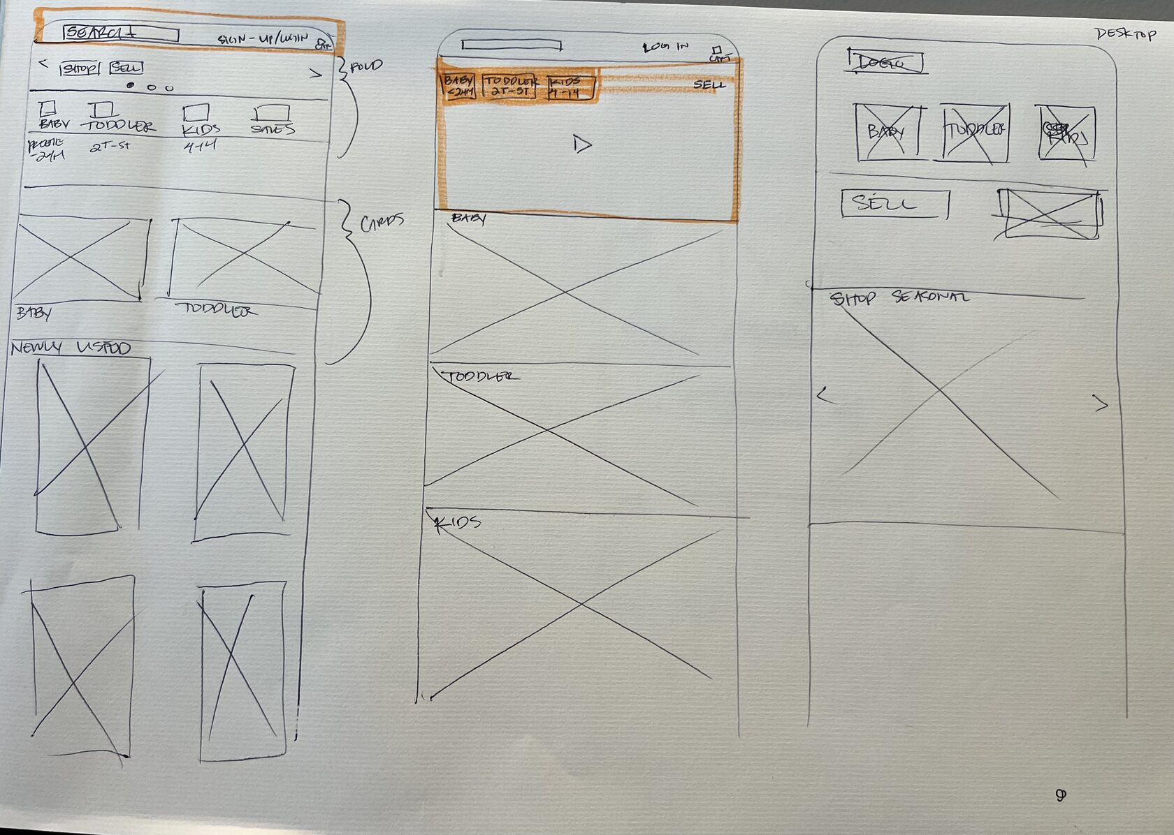
Paper Wireframes
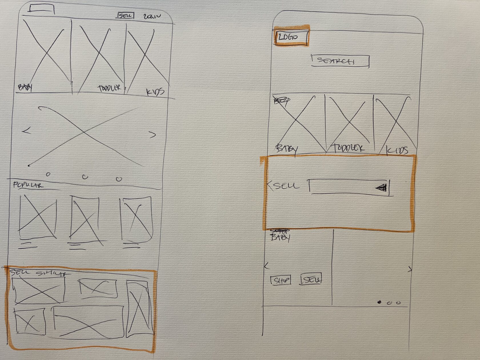
I sketched out paper wireframes for each screen in my app, keeping the user pain points about navigation, browsing, selling, and checkout.
This home screen paper wireframe variations to the right focus on Hick’s law and enabling the user to make an easier decision.
This home screen paper wireframe variations to the right focus on Hick’s law and enabling the user to make an easier decision.
Low-Fidelity Prototype
I prioritized two user flows. The first user flow emphasizes the goal of purchasing items on the app. The second user flow concentrates on the users’ ability to sell and list items. It was important to note that a user must create an account prior to listing an item. The user must create an account in order to audit and moderate their listings.
Usability Parameters
Study Type: Unmoderated and moderated usability study
Location: Remote
Participants: 5 Participants
Length: 20-30 Minutes
Location: Remote
Participants: 5 Participants
Length: 20-30 Minutes
Usability Findings
Finding 1: Users need to make an account to review their selling dashboard
Finding 2: Users need to have the ability to set a different billing address and shipping address
Finding 3: Users need a way to save their checkout information
Finding 4: Users need to be able to generate a shipping label from their listing that sold
Finding 2: Users need to have the ability to set a different billing address and shipping address
Finding 3: Users need a way to save their checkout information
Finding 4: Users need to be able to generate a shipping label from their listing that sold
Mockups
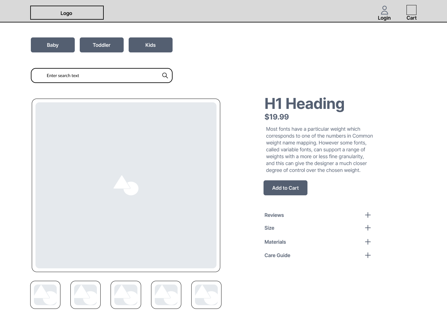
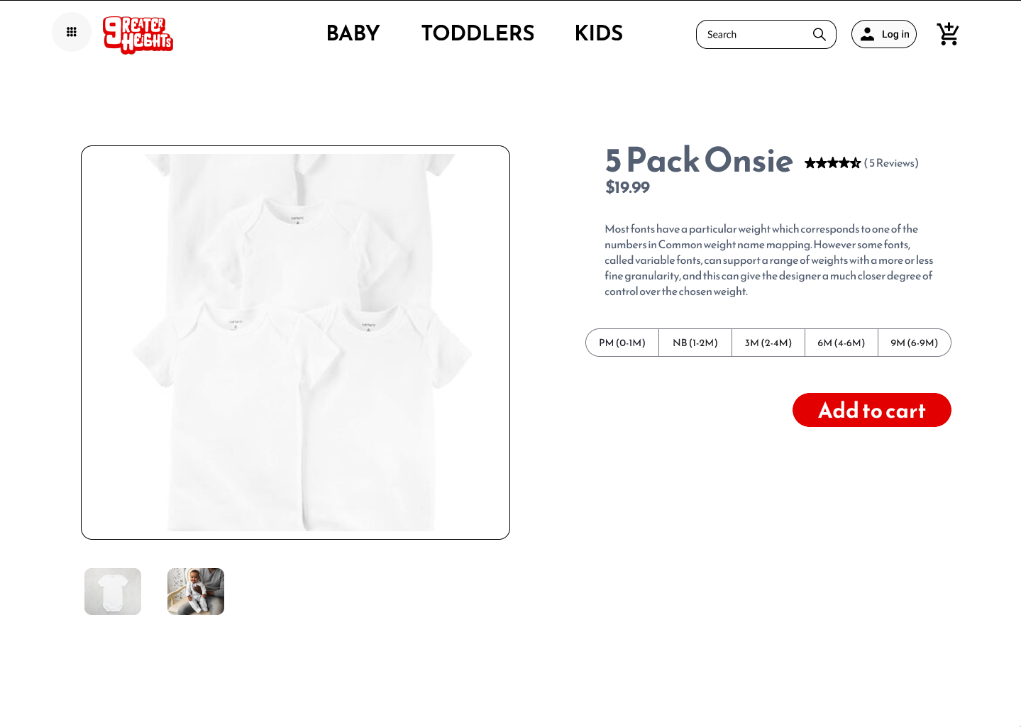
Based on the insights from the usability study, I made changes to the product page. Since the website is a selling platform for wholesale as well as independent sellers, features such as "Size" will be contingent on the Seller type.
For example, a wholesaler will be granted the ability to specify a size. On the other hand, an independent seller will not have this feature as they are only selling one item.
In addition, I made changes to the navigation menu. I stacked these visual elements to better the negative space that is garnered through desktop screen. I ensured that visual elements are contained within the fold.
Before Usability Study
After Usability Study
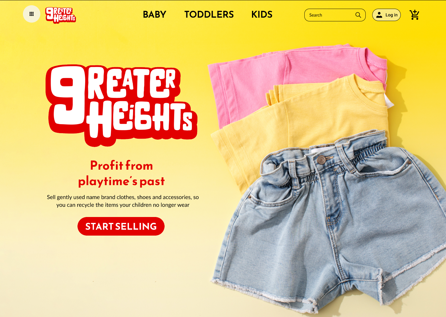
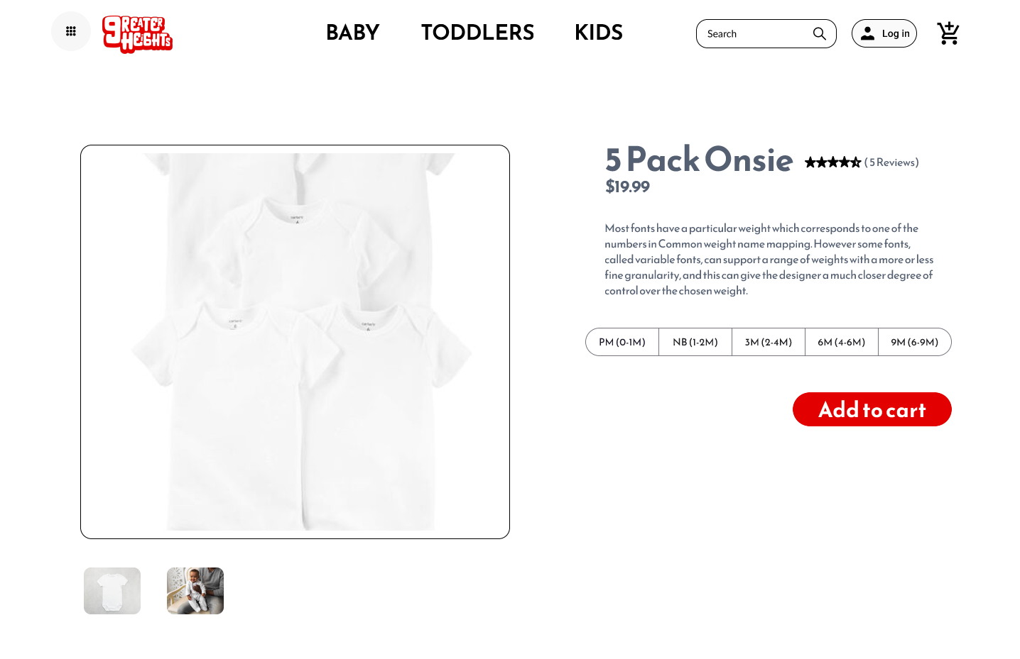

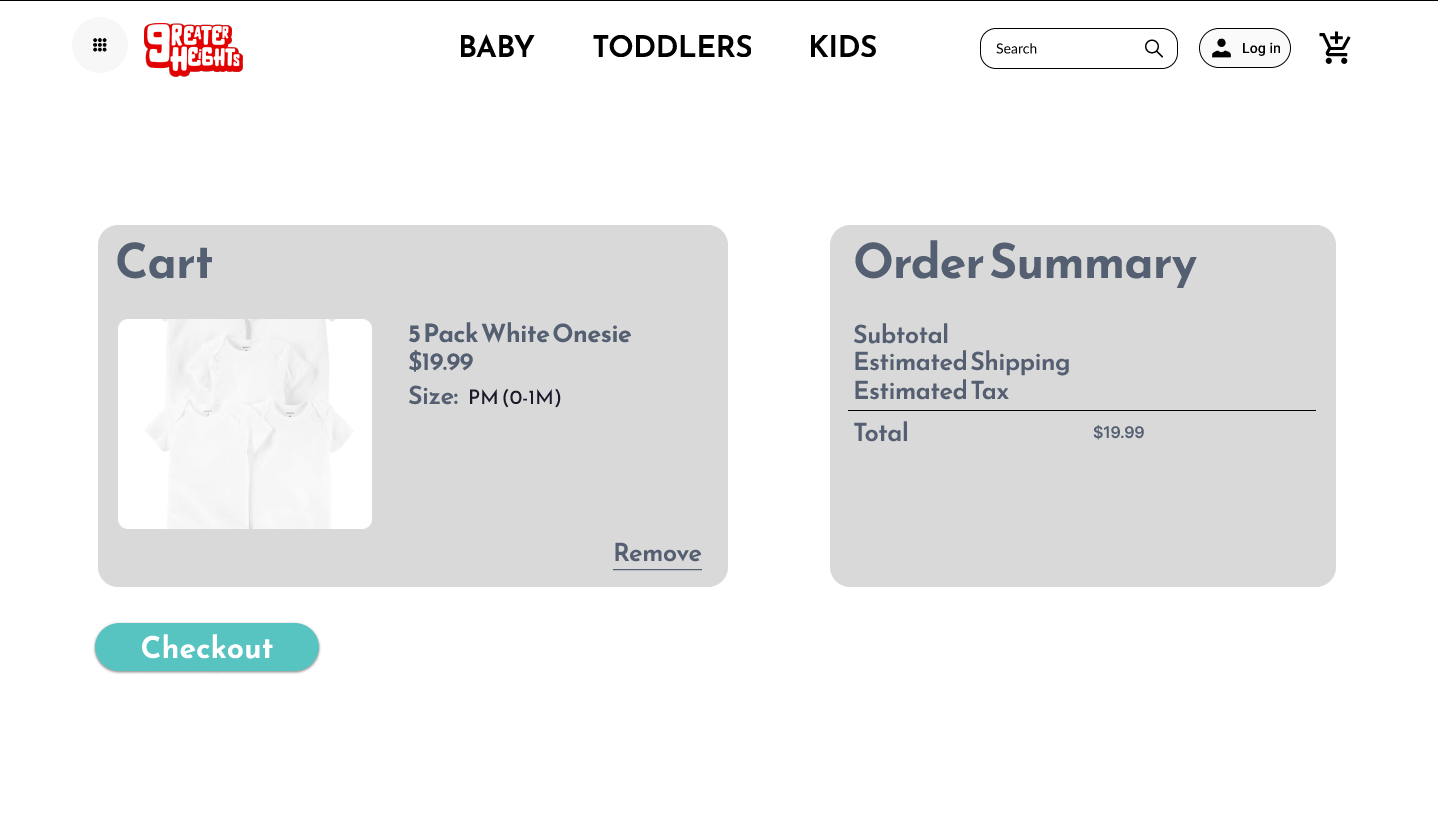
Mockups: Original Screen Size Variations
I included considerations for additional screen sizes in my mock-ups based on my earlier wireframe iterations. In regard to the products being displayed on a desktop, I used a 3 column design for mobile in order to accommodate the screen size.
High-fidelity Prototype
I included new screens to the high-fidelity prototype that I discovered in my initial usability tests.
Accessibility Considerations
Gestures: I used a carousel for the product images. Users are able to tap and swipe through photos on mobile devices
Headings: I used headings with different sized text in order to establish visual hierarchy
High Contrast: I used a high contrast color palette in order for users to better distinguish visual elements. In addition, I created hover and on press animations in order to allow the user to identify where they are within the app and what they have selected.
Takeaways
Impact: Our target users have asserted that the design was very minimal and allowed them to easily make decisions with little to no distractions.
What I learned: I learned that Hick's Law allows the user to complete tasks faster. On the other hand, minimalistic approaches to design may mitigate the features that would enhance the users experience. I learned to discern the priorities of "nice-to-have" features and a minimum viable product.
What I learned: I learned that Hick's Law allows the user to complete tasks faster. On the other hand, minimalistic approaches to design may mitigate the features that would enhance the users experience. I learned to discern the priorities of "nice-to-have" features and a minimum viable product.
Next Steps
Conduct additional usability tests and identify any steps within the user flow that may hinder user goals.
create your own happiness
